
ROLE
UI/UX Designer
TOOLS
Figma & Notion
DURATION
July – Sep 2023
Aliexpress is an online retail service (e-commerce portal), subsidiary of Alibaba much like Amazon, Flipkart and Snapdeal, in it’s basic functionality. It is a service made up of small businesses in China and elsewhere, offering products to international online buyers(B2C). It was founded 13 years ago and has been serving 220 countries and regions. It supports in 18 different languages. The site has been found useful by many people; however, it has also received a lot of criticism because of its user interface and experience overall.
Objective
To grow and entice new users to signup and use the site.
To build trust with potentional and new users to increase sale’s and revenue.
To update the site’s Visual Design and overall UI.
Mission
The mission of this project is to redesign the Aliexpress e-commerce platform thus providing a smoother user experience, offering clear and simple information.
Vision
Improving user experience
Being more transparent
Engaging your customers
Audience
American consumers who prefer online shopping to in-store shopping and shop online at Amazon, Target, Walmart, and eBay.
User Research-
Due to the time constrained and limited resources, I have utilized the top forums (reddit, quora, google reviews and google play store) to know what the previous, existing and potential users think about aliexpress.com to get the better understanding of the company and its users.
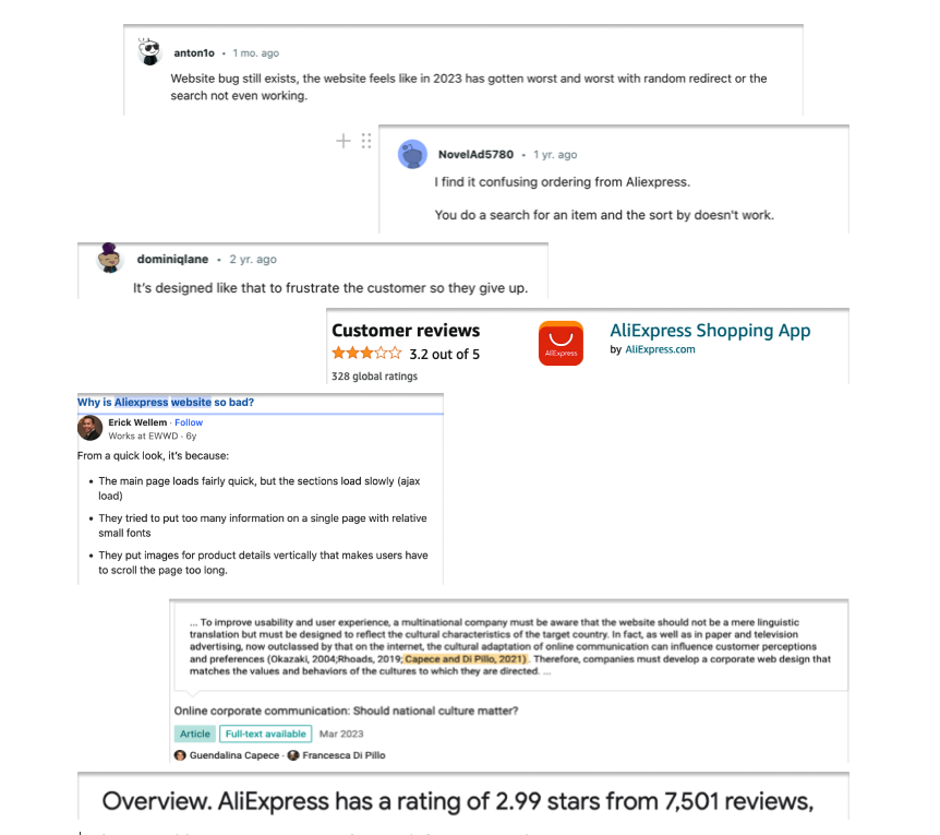
‘’Amazon site has crushed Aliexpress. Why ? Because they follow design principles that focus on reducing coginitive load, among other things”.
“Discovered the site last month and looks very unreliable to me. It’s like o messy messier olx.”
“They haven’t updated the interface and they addding lot of data.”
“Striking the balance between simplicity and utility, a well-organized large database on a website can offer enhanced functionality without compromising on user-friendly design.”
Research Findings-
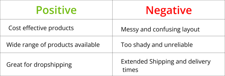
The feedback received was characterized by a nuanced blend of both negative and positive comments, reflecting a diverse range of perspectives and experiences. While some users expressed dissatisfaction with certain aspects, others highlighted positive aspects of the product or service. This balance of opinions provided valuable insights into areas of improvement as well as strengths to be leveraged
Problems & Presumptions-
By meticulously analyzing the problem landscape and underlying assumptions, gained valuable insights into the root causes and potential solutions. This comprehensive understanding empowered to approach the issue strategically, guiding our decision-making processes with clarity and confidence.
- Lack of trust and security.
- Cluttered and messy design.
- Customer Service not that great.
- The overall process from login to checkout is marred by a lack of smooth transition.
- Comparison of products is not easy.
- Difficulty in filtering the products search.
- Not finding customers’ reviews.
- Product description not clear.

- Website is difficult to navigate.
- The site has bad UX.
- Landing page is overwhelming, cluttered and flashy.
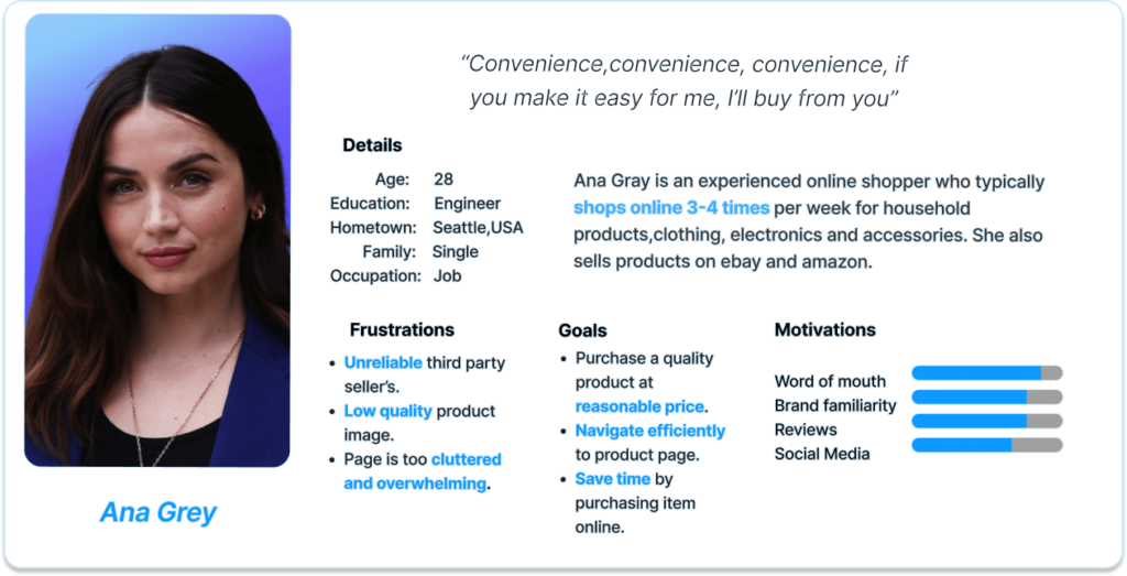
Based on the user research/interview, I created a persona to represent a potential AliExpress customer. I defined the user’s online shopping goals and their frustrations with the current AliExpress interface.
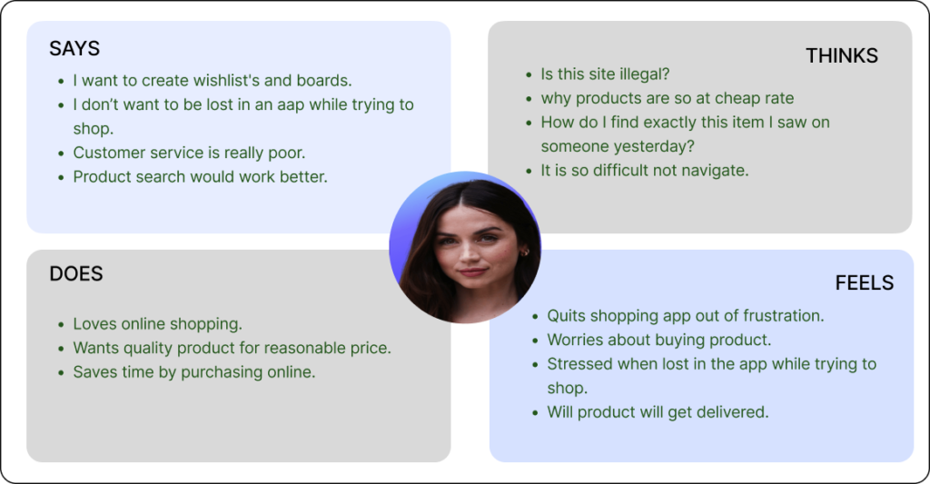
To cultivate a deeper understanding of users’ sentiments and perspectives, I thoroughly crafted an empathy map. This helped me design solutions that truly meet their needs.”
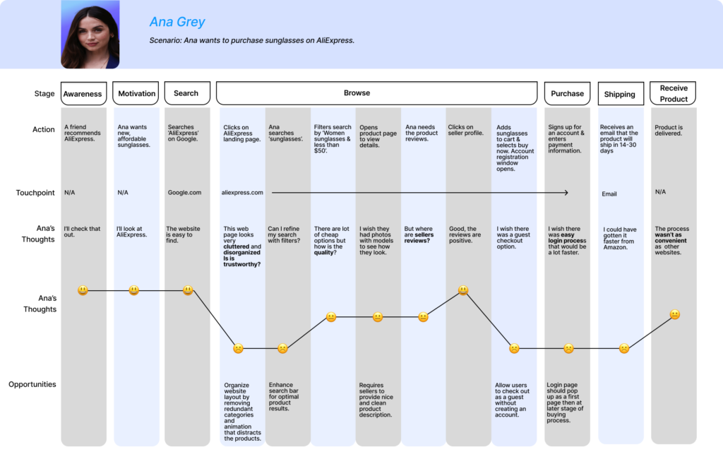
I developed a journey map to understand the user’s feelings while purchasing a product from AliExpress. This helped me identify specific pain points in the process and opportunities to improve the users’ experience when purchasing a product.
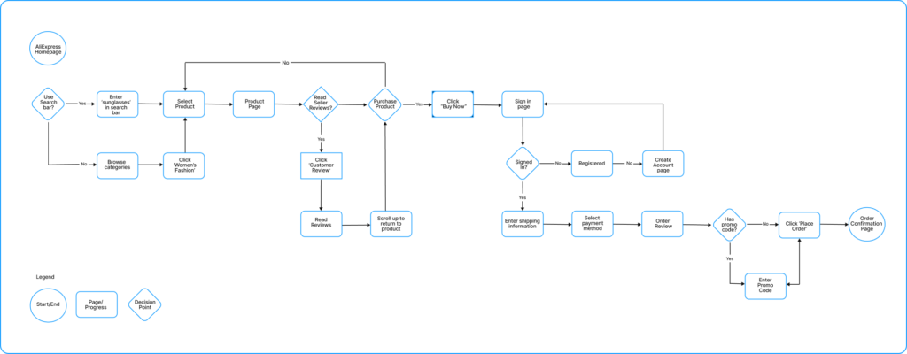
Created a user flow of the same scenario to map out the steps required to purchase a product.
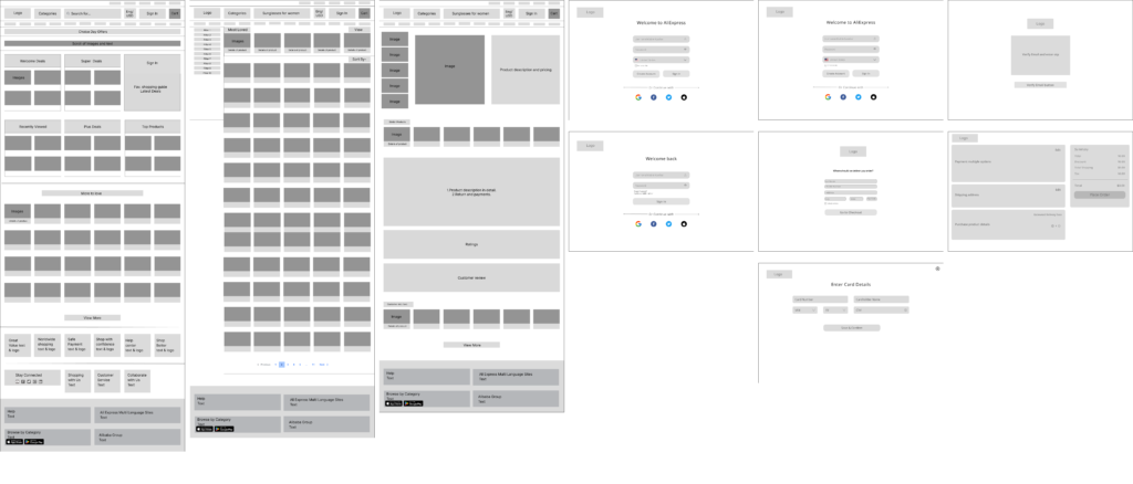
Initially, wireframes were made to build variations of the design to establish a basic structure of the layout for web redesigning.
WireFrames
An interactive High-Fidelity Prototype of the AliExpress desktop website was redesigned using Figma.
Landing Page
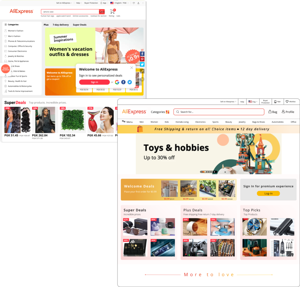
Before(Problem)
•The layout is very cluttered and disorganized.
•The category tab is not accessible once you scroll down, requiring you to scroll back up to choose a different category, which is not user-friendly.
•There are couple of pop-ups on the landing page.
•The profile tab is small and placed in the right corner of the website, making it difficult to locate and access.
•Once the sign-in pop-up is closed, there is no visible sign-in or log-in option available.
After(Solution)
•The layout is sleek and intuitively organized.
•Easy navigation and user friendly crafted.
• A category tab has been added to the main bar, ensuring swift access to all categories.
• A menu bar has been designed to provide one-click access to different categories.
•The log-in/sign-in option is always available.
Search Result Page
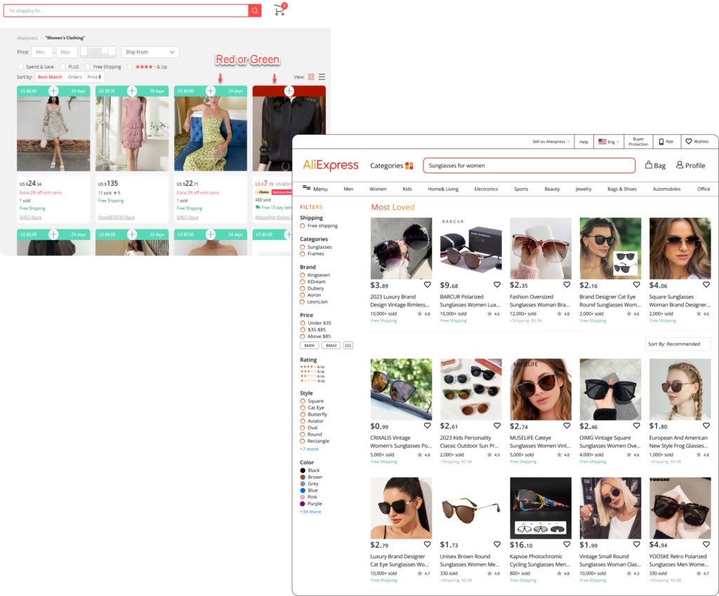
Before(Problem)
•Basic Product Description not provided.
•To check return policy need to make multiple clicks and multiple windows get open for details.
•Clicking on the specifications menu takes you directly to the specification details below the description. This requires scrolling back up to view other details, such as customer reviews and the description, creating a hassle.
After(Solution)
•A basic description of the product has been added for better understanding.
•Product description, specifications, and return & payment information are now included in a single table with multiple tabs, allowing easy access to specific data without excessive scrolling.
•A Returns tab has been created, providing all return policy details with a single click.
Product Details Page
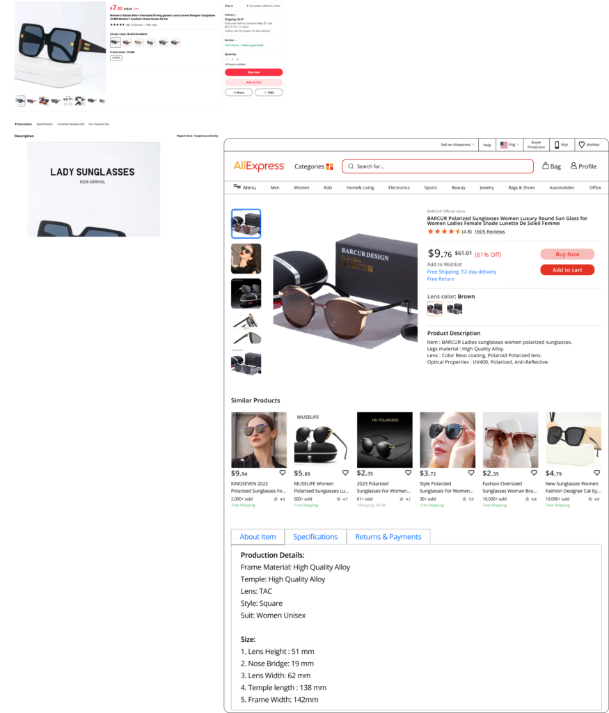
Before(Problem)
•Basic Product Description not provided.
•To check return policy need to make multiple clicks and multiple windows get open for details.
•Clicking on the specifications menu takes you directly to the specification details below the description. This requires scrolling back up to view other details, such as customer reviews and the description, creating a hassle.
After(Solution)
•A basic description of the product has been added for better understanding.
•Product description, specifications, and return & payment information are now included in a single table with multiple tabs, allowing easy access to specific data without excessive scrolling.
•A Returns tab has been created, providing all return policy details with a single click.
Checkout , Log-in /Sign-up Pages
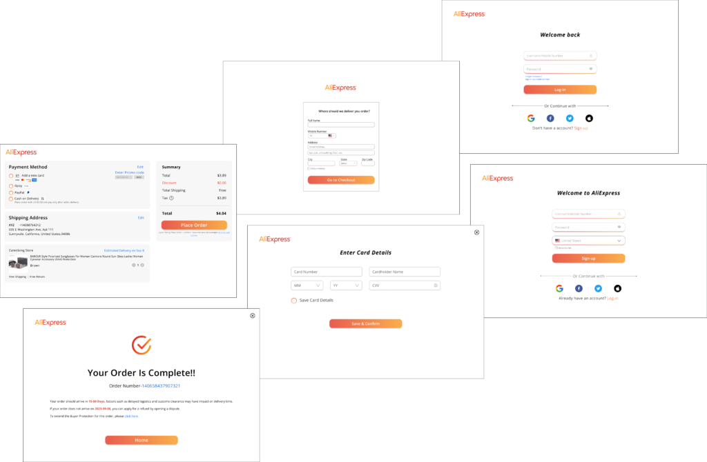
I really enjoyed working on this project. This topic was close to my heart as I myself have faced the issue while ordering products on Aliexpress and why they are so data driven. At first, it was challenging for me. Not only from a Research point of view but also for redesigning as I was learning a new tool and culture difference between countries(China & USA). In the initial stage of the project, I made a lot of assumptions. My assumptions were quickly proven to be wrong once I started the user research. This shows the importance of ensuring data-driven design decisions, to meet the actual needs of the users. Also, as a designer, we are often lured by attractive, trendy, and out-of-the-box designs. But, We must always remember the ‘why’. The primary goal is to understand the user, their problems and then come up with a design that solves them.Most important learning: “One should never settle with the first design idea, keep getting feedback and iterate your designs as – No Design is perfect, there is always room for improvements”.
